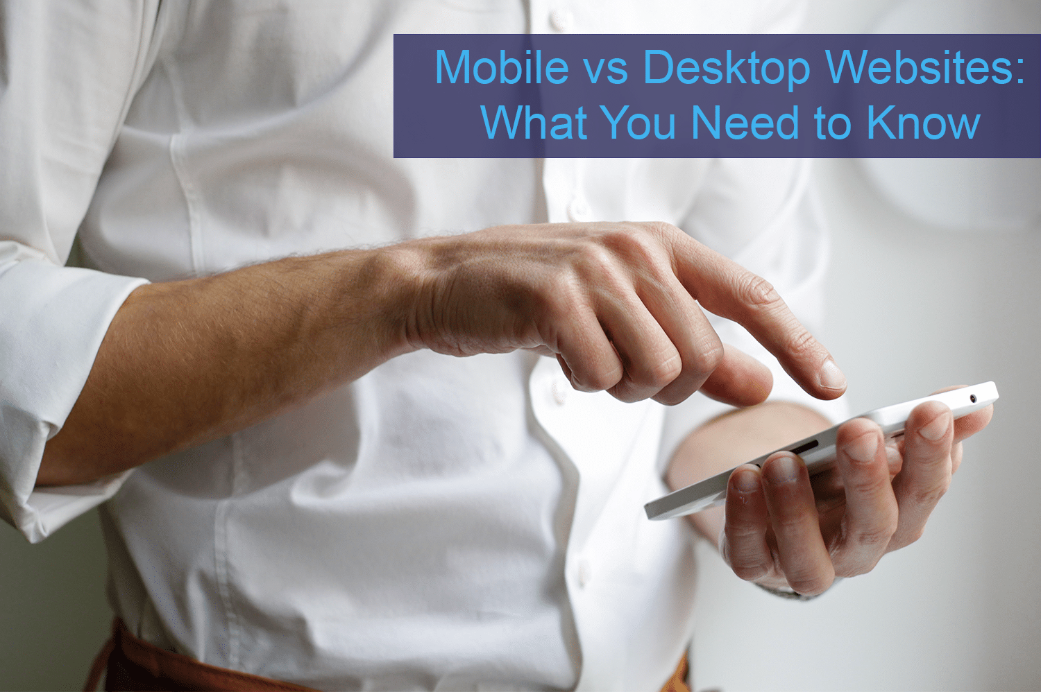
Having mobile and desktop versions of your website are very important for your small business. But what’s the difference between them? Here’s what you need to know about mobile websites and the differences between mobile vs desktop sites!
Mobile vs Desktop Websites
Having everything at our fingertips is the new way of the world, and it won’t be reverting back. In 2020, mobile devices drove 61% of visits to U.S. websites, while desktops were responsible for 35.7% of visits. Mobile interfaces are improving, and users are getting accustomed to being connected at all times.
What is (and isn’t) a Mobile Website
A mobile website is a specifically designed and scaled site that functions beautifully on tiny smartphone screens. A common misconception is that mobile websites are just smaller versions of their regular or “desktop” website. If you search the web right now and find a website that’s illegible without using your fingers to expand what you see on your screen, then you’re viewing a desktop website on your smartphone. That’s not a mobile website and not what you want your customers to look at when they look for your business on their smartphones.

Without a mobile website, you miss out on potential customers and profits to the competition.
Why Mobile Websites are Essential
Mobile app users have small thresholds for patience because content is consumed quickly. If something doesn’t load fast enough, it likely won’t be looked at. The vast majority of mobile device users will abandon a non-mobile website in seconds in favor of a mobile-optimized website. That’s because the optimized website will load quickly, have the correct formatting, and be easy to navigate on a smartphone. Without a mobile website, you miss out on potential customers and profits to the competition. In fact, 40% of users have gone to a competitor’s website after a poor mobile experience.
Responsive Website Design
Desktop computers, laptops, and the need for good desktop web design will never go away completely. Nevertheless, mobile is quickly becoming the web surfing medium of choice. Creating a mobile website or app can take a lot of work and money. That’s why responsive web design is the way to go. Responsive web design creates a system for a single site to react to the size of a user’s device with only one URL and one content source. This means a responsive website has a flexible and fluid layout that adjusts according to screen size and will look great on a desktop, tablet, and mobile phone browser. Not only will this help with your Google ranking, but it will help improve your bounce rate too.
We hope this cleared up what a mobile vs desktop website is! If you need a responsive website for your small business, we are here to help! Our responsive website design is the name of the game and will make your site look great and function perfectly on all devices. We have been assisting small businesses with growth since 2008 and would love to help you out! We’re located in Cave Creek, Arizona, and Montrose, Colorado, but serve nationwide.


