Welcome to Our Case Studies: Real Results, Real Success
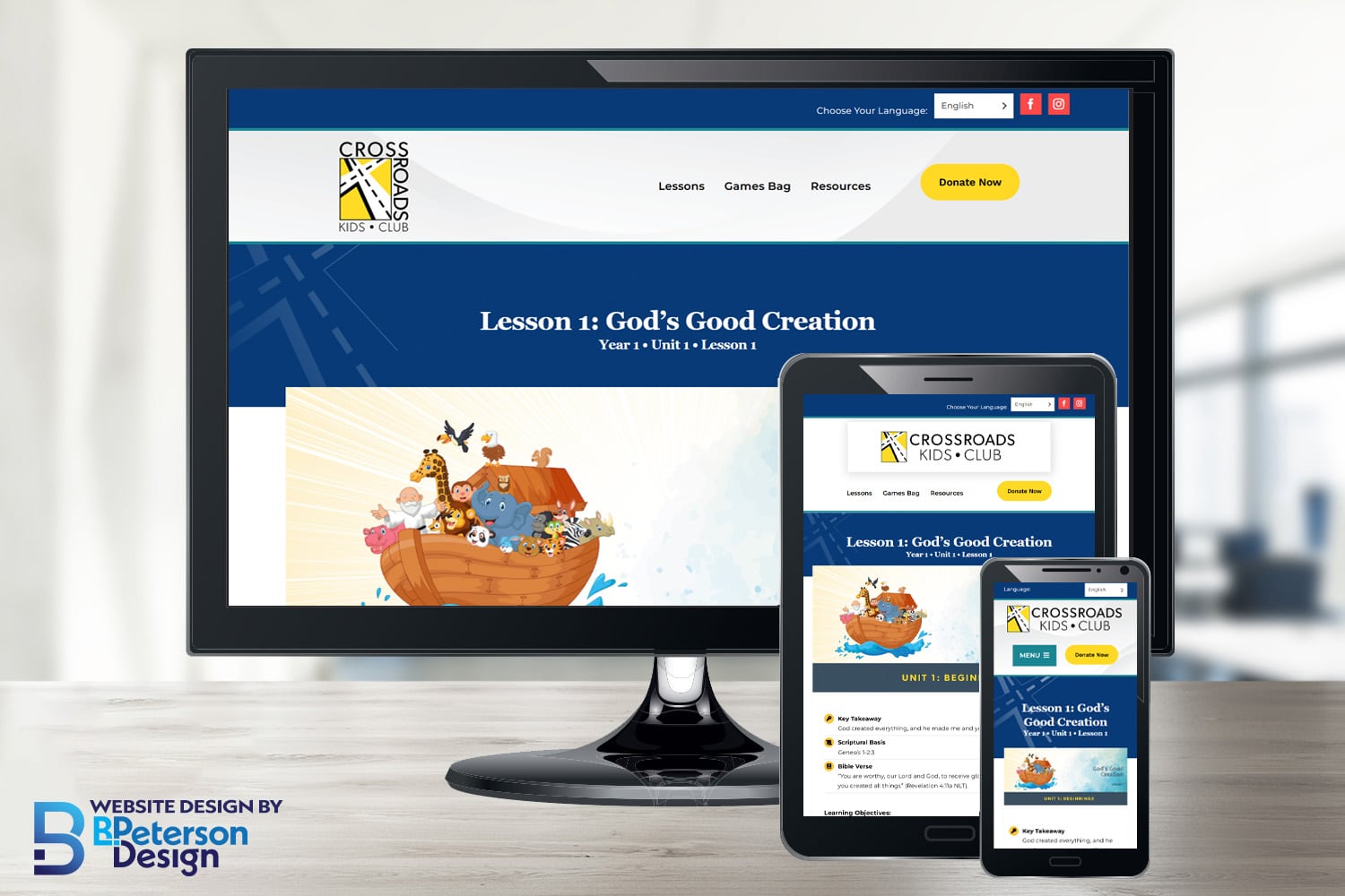
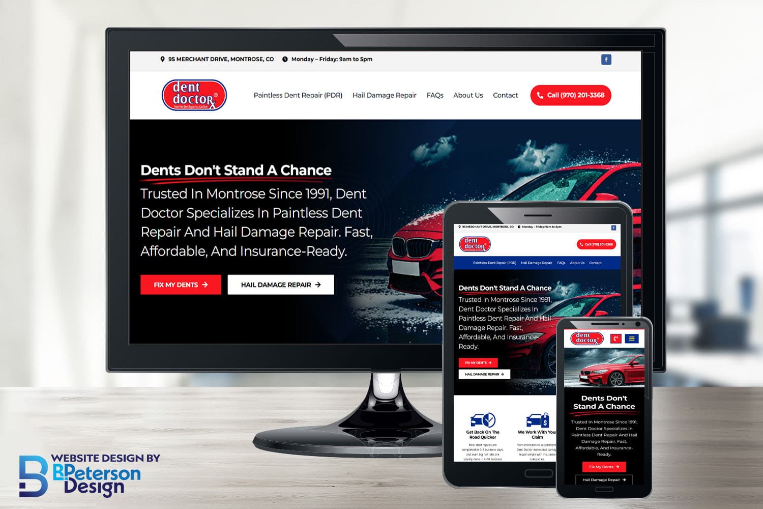
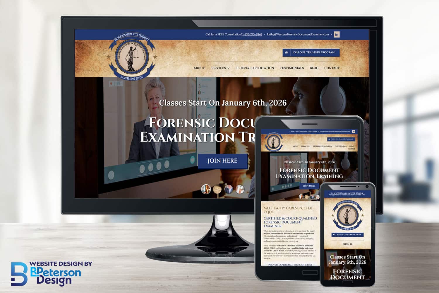
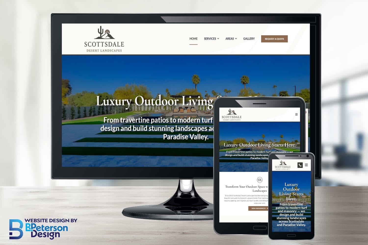
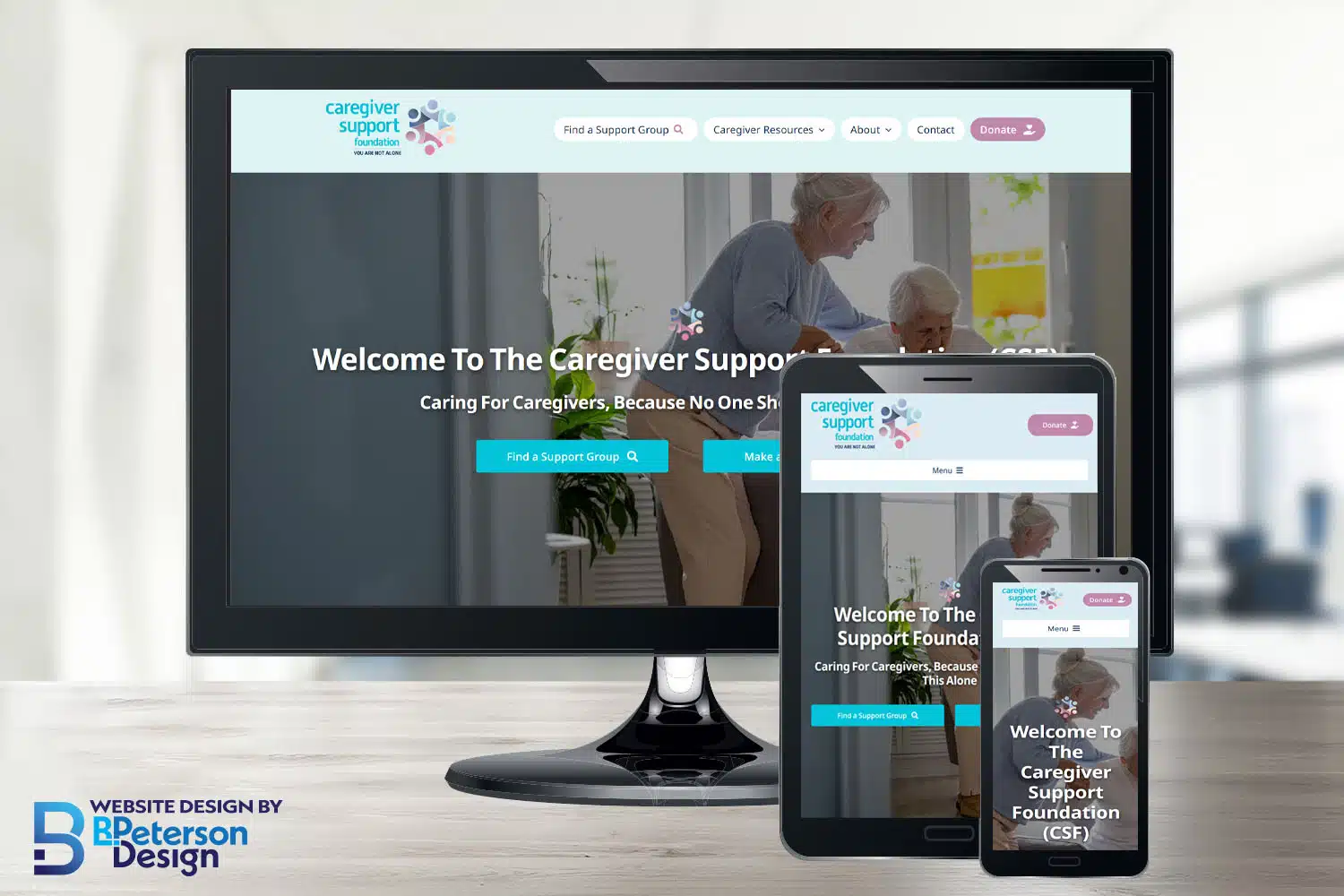
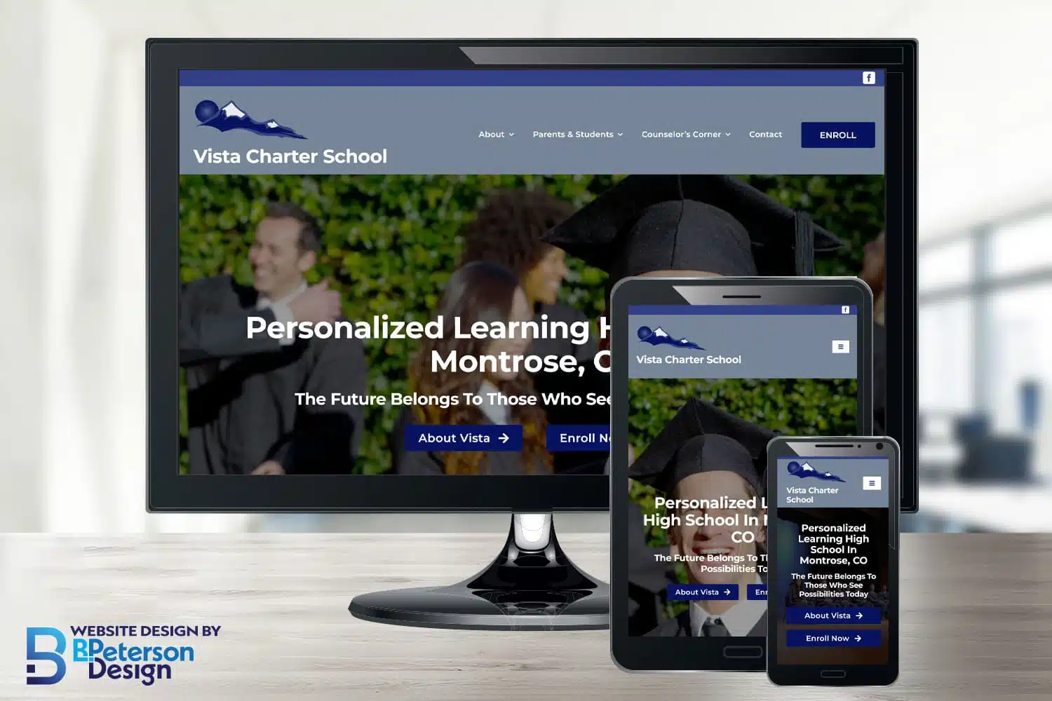
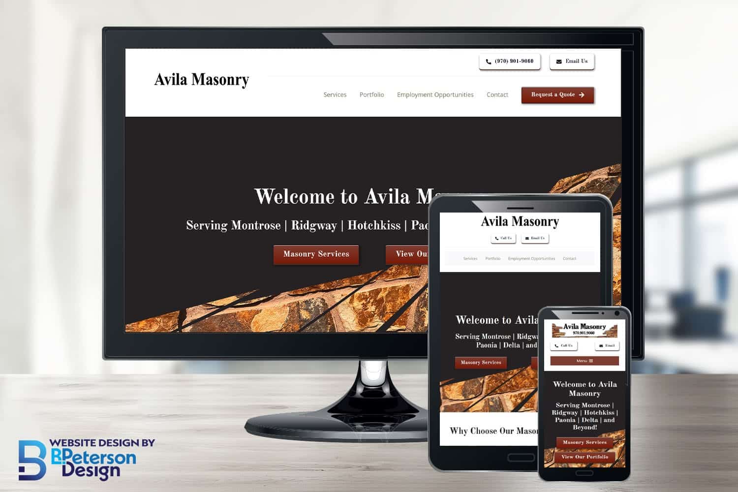
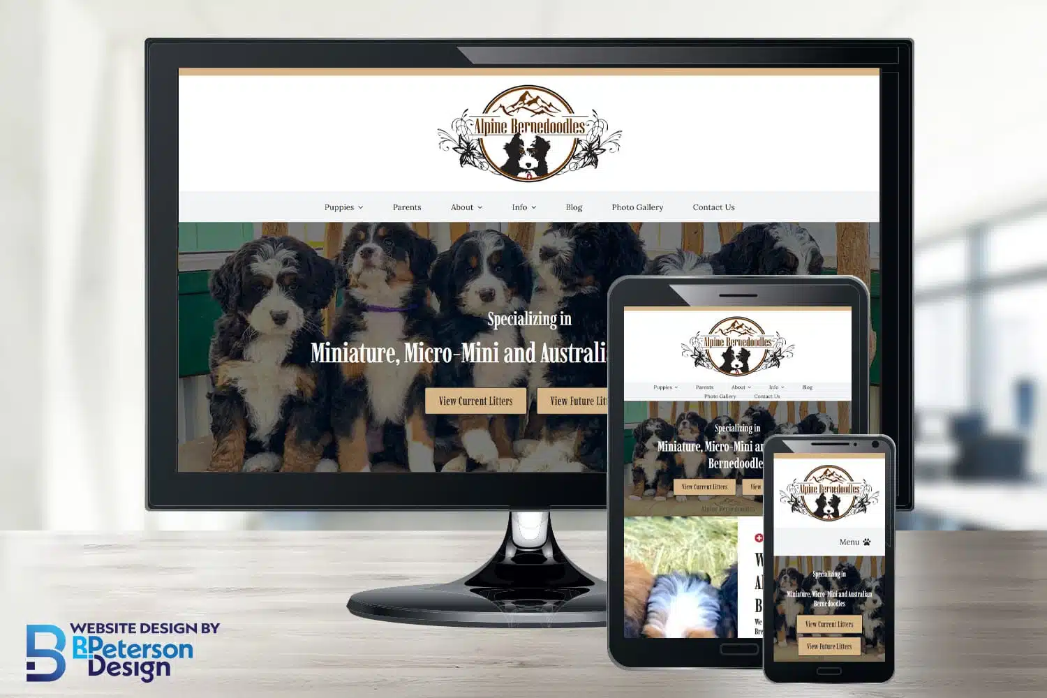
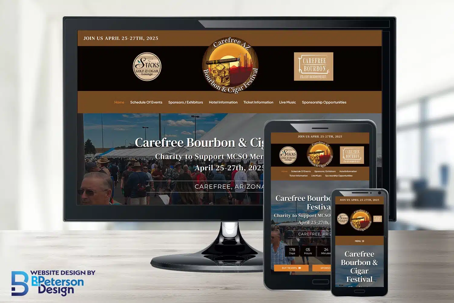
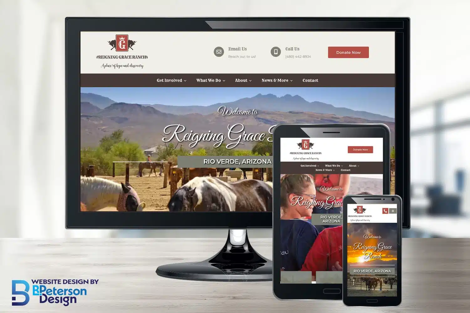
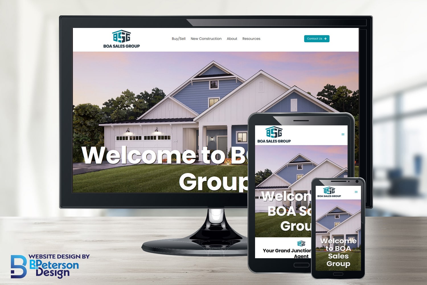
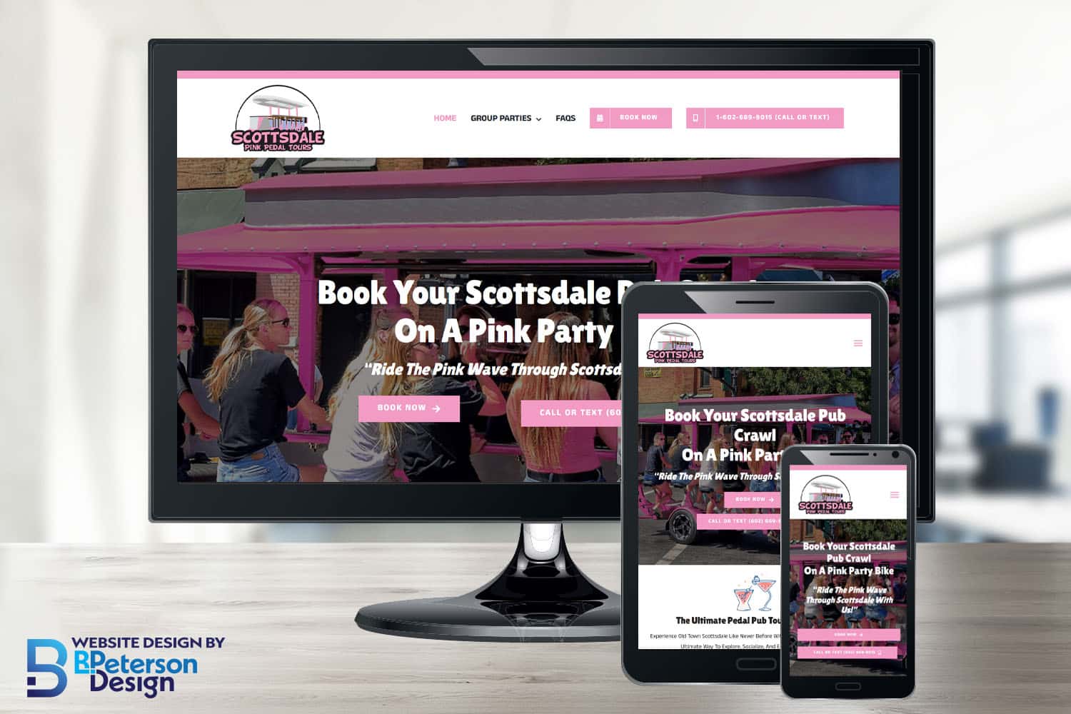
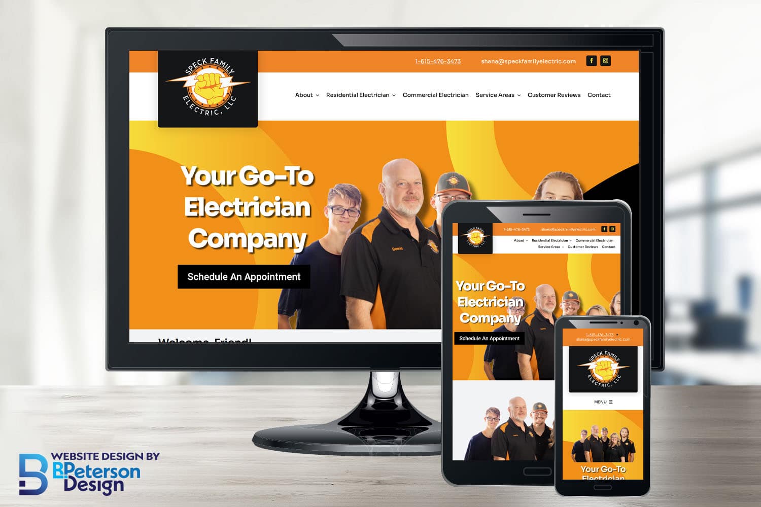
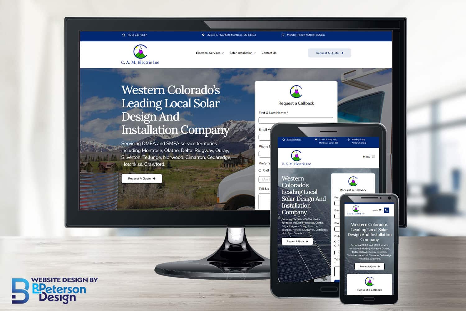
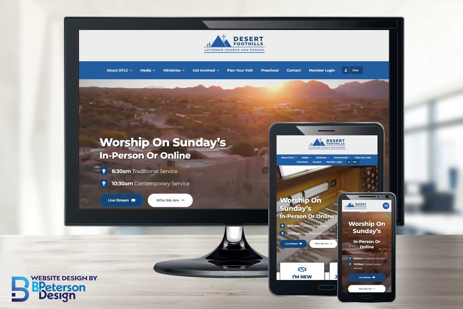
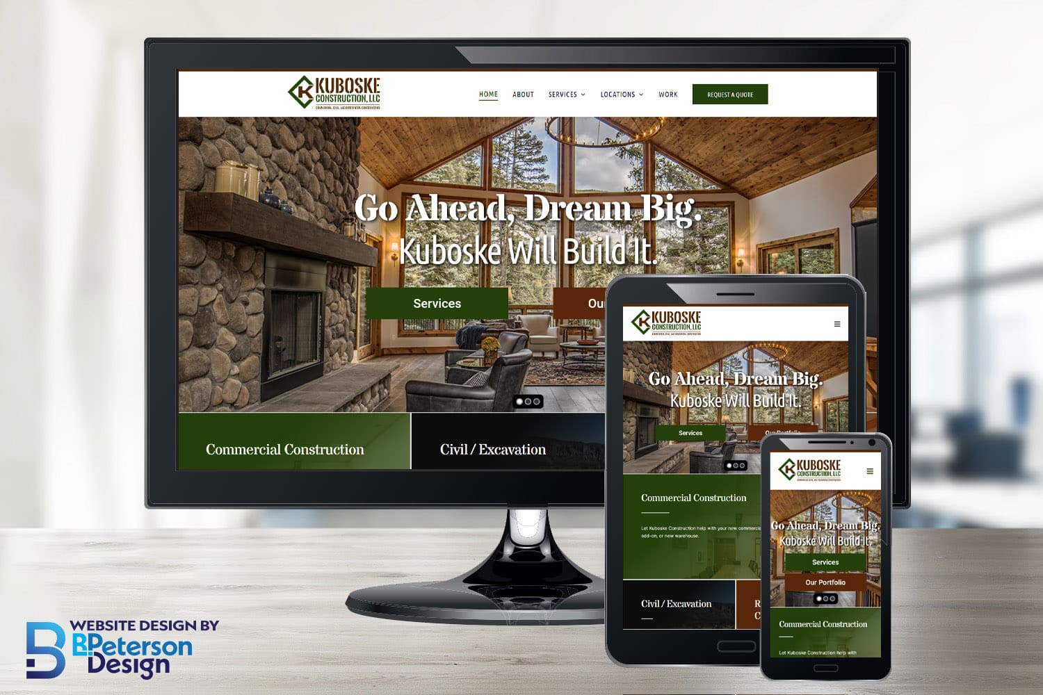
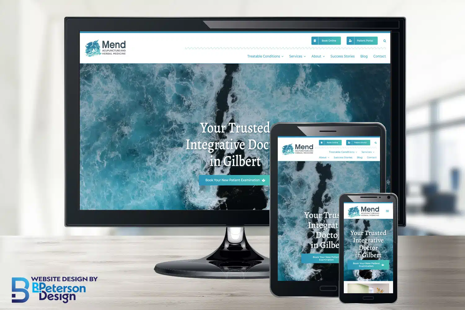
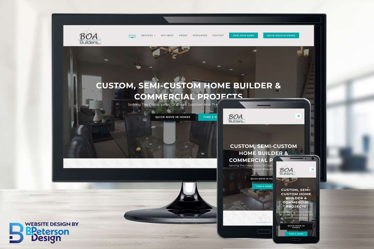
At BPetersonDesign, we believe the best way to showcase our expertise is through the success of our clients. Our Case Studies page highlights real-world examples of the work we’ve done to help businesses like yours achieve their goals. From professional business websites to eCommerce platforms and nonprofit organizations, each project tells a story of collaboration, creativity, and results-driven design.
Here, you’ll find in-depth looks at the challenges our clients faced, the solutions we delivered, and the measurable outcomes that followed. Each case study is a testament to the high-quality, SEO-friendly websites we build right here in the USA—designed to help businesses grow, engage, and thrive.
Whether you’re seeking inspiration or evaluating if we’re the right fit for your next project, our case studies provide a transparent view into the impact we can make. See how we’ve helped our clients succeed and imagine the possibilities for your business.
Let’s make your goals a reality together. Ready to start your journey? Contact Us Today.